6A-008 · Premium Med Spa Website
The 6ix Aesthetics
LiveDesign + Build202698 PERF · FULLY STATIC
Outcome
A premium med spa site that reads as a “$30k agency” build — one motion identity, a single conversion path, and a fully static architecture that still hits Lighthouse 98 on desktop.
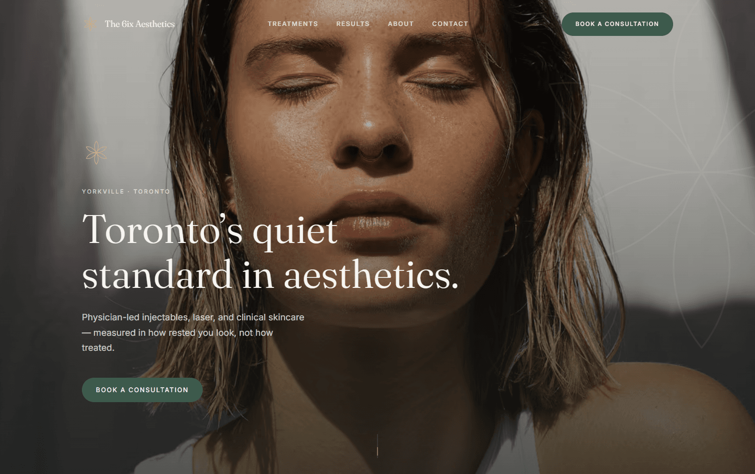
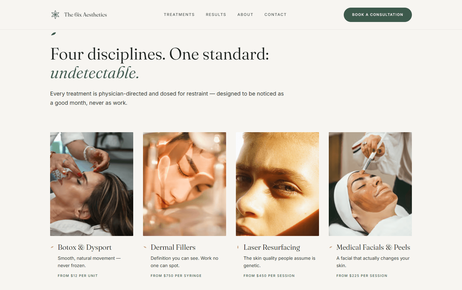
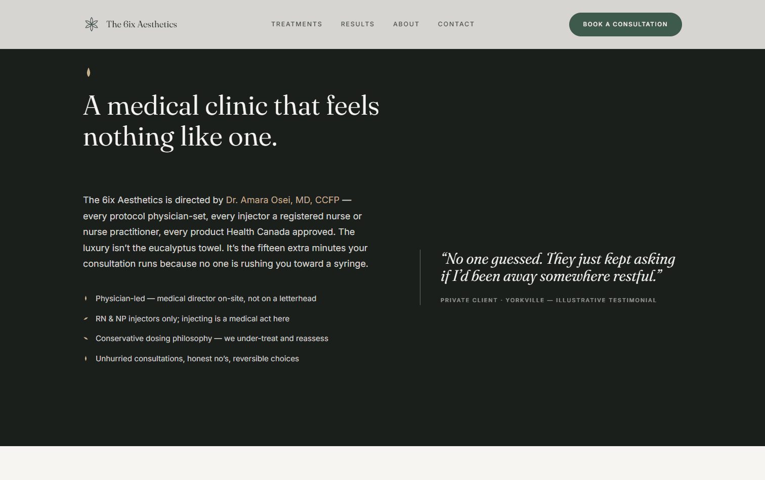
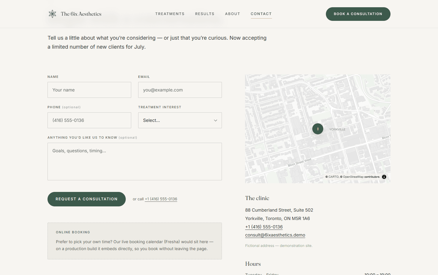
The 6ix Aesthetics is a fictional Toronto med spa, built to make one argument: premium design doesn't have to be complicated. Most med spa sites fail in one of two ways — outdated template builds heavy with teal-and-gold clichés and “20% off” urgency, or text-heavy pages that bury the booking action. Both undermine the one thing a med spa actually sells: trust in a premium, medical-grade experience. My thesis was the inverse of the template playbook — luxury is communicated through restraint.
Restraint is the whole product
Most med spa sites betray themselves with urgency — countdown timers, star-rating carousels above the fold, “20% off Botox.” That playbook sells discounts, not trust, and trust is the only thing a premium clinic has to sell. So I inverted it: quiet exclusivity instead of pressure, generous whitespace instead of dense service grids, and one calm CTA — “Book a Consultation” — instead of a wall of offers. Every decision after that was a subtraction, not an addition.
- Quiet exclusivity over urgency — no countdown timers, no “% off”
- Generous whitespace as the primary luxury signal
- A single calm CTA — “Book a Consultation” — never a discount
One motion identity, not scattered effects
The fastest way to look like a template is to bolt on unrelated animations. Instead I built a single motion language: all parallax runs on four named depth bands — background at 0.3x through floating elements at 1.15x — with the same slow easings (0.4 / 0.8 / 1.4s) everywhere. Nothing snaps or bounces; the motion is deliberate and unhurried, so it reads as part of the brand rather than decoration on top of it. GSAP + ScrollTrigger drives the scroll choreography, Framer Motion handles micro-interactions, and Lenis smooths the whole scroll.
- Four named depth bands: background 0.3x → floating 1.15x
- Consistent slow easings (0.4 / 0.8 / 1.4s) — nothing snaps
- GSAP ScrollTrigger + Framer Motion + Lenis, one coherent system
A petal motif that makes it un-templatable
One shape does the structural work across the whole site. The petal shows up as section markers, image masks, list glyphs, and the page-transition mark — all derived from the same primitive. That's what separates a real design from a template: not a unique hero image, but a consistent visual grammar repeated with intent. Once the motif is a system instead of an ornament, the design can't be lifted onto another brand without falling apart.
- Petal primitive → section markers, image masks, list glyphs, transitions
- A repeated visual grammar, not one-off decoration
Conversion architecture over decoration
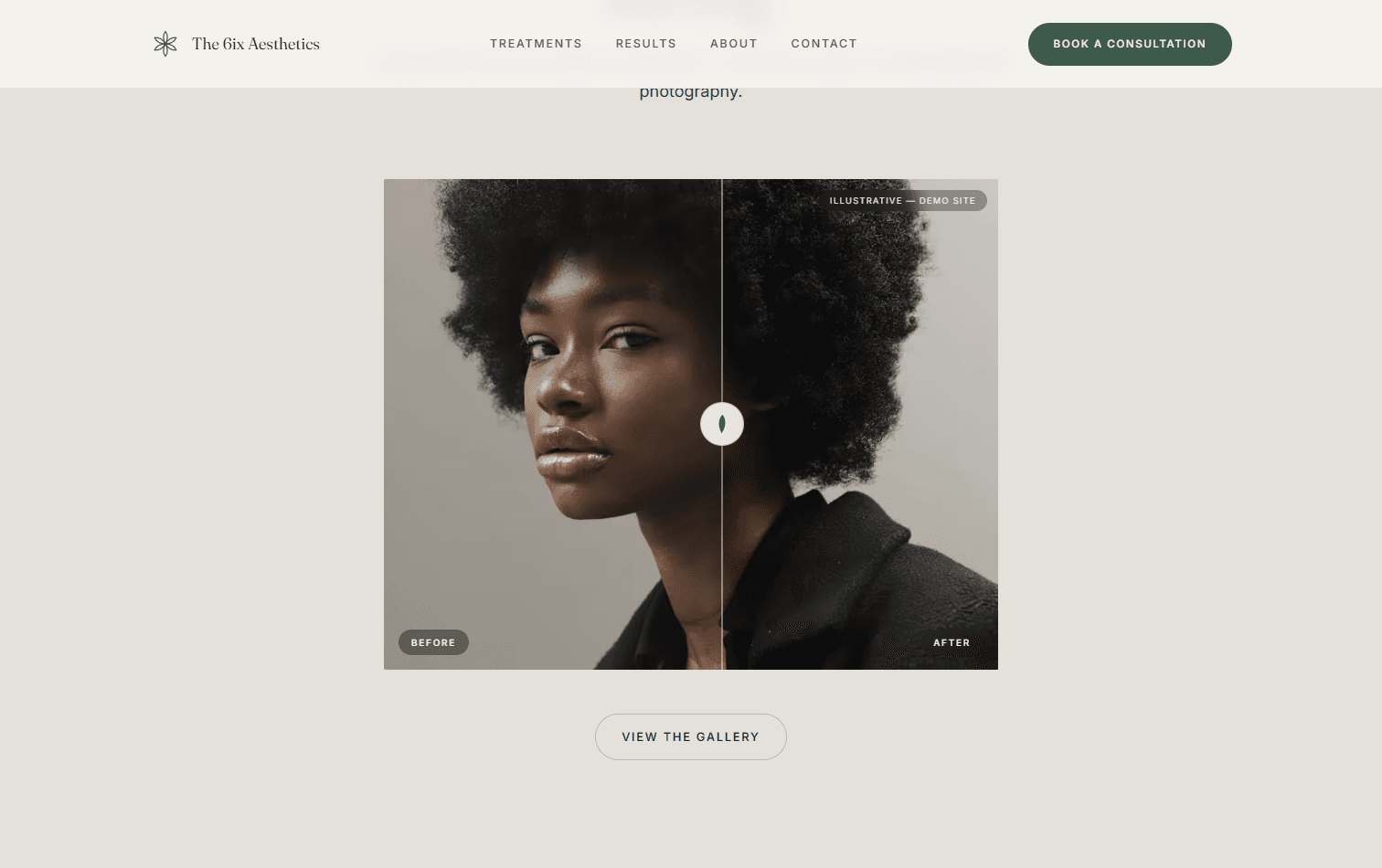
Premium doesn't mean precious — the site still has to book consultations. Every page funnels to the same action, and the interactions all serve it: a draggable before/after results slider, an interactive clinic map, and a validated consultation form with a sticky CTA on mobile so booking is never more than a thumb away. The treatment copy is suitability-aware and compliance-conscious — physician-directed language, illustrative-content disclosures — because a med spa is a medical context, not just a spa.
- Single conversion path to one CTA on every page
- Draggable before/after slider, interactive clinic map, sticky mobile CTA
- Compliance-conscious, physician-directed treatment copy
Accessibility and speed are part of the luxury read
Jank breaks the premium spell, so performance was treated as a design feature, not a cleanup pass. The site ships 100% static — 15 prerendered routes with zero server functions, per-treatment pages generated at build time — on Next.js 16 (App Router, Turbopack), React 19, and Tailwind v4, with MapLibre GL powering the clinic map without an API-key dependency. Accessibility was a hard gate: WCAG 2.1 AA, full keyboard operability on the sliders and menus, and a prefers-reduced-motion path that disables every parallax while keeping the opacity fades. Lighthouse came back 98 on desktop and 88 on mobile.
- 100% static — 15 prerendered routes, zero server functions
- Next.js 16 (Turbopack) · React 19 · Tailwind v4 · MapLibre GL
- WCAG 2.1 AA, reduced-motion disables parallax, Lighthouse 98 / 88
- Credits
- Solo — design & direction
- AI
- Set the brief and the motion system, then directed Claude Code through the build — reviewing every diff and making each design and compliance call myself.