Selected Work
Work
Things I’ve designed and shipped — the flagship builds, each a full case study. Scroll through.
08 case studies · scroll to begin
Selected case studies
Restaurant Web Experience
Nous Sommes Un
LiveDesign + Build202696 PERF · 100 A11Y/SEO
Outcome
A cinematic, photography-heavy restaurant site that still hits Lighthouse 100 across accessibility, best practices, and SEO — 96 performance on desktop, proving atmosphere and speed aren't a trade-off.
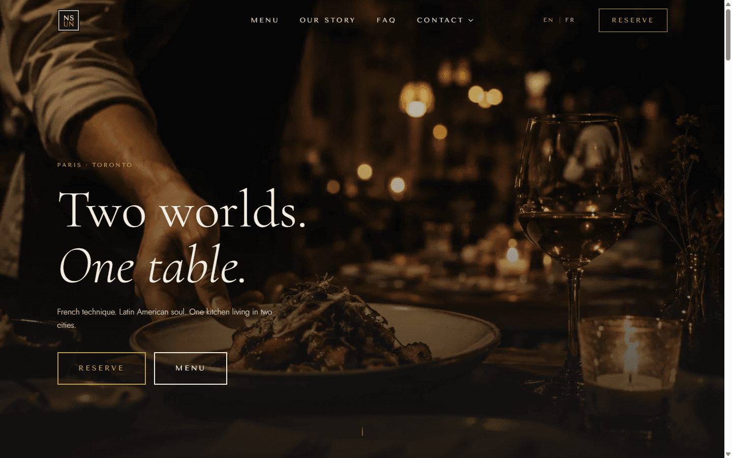
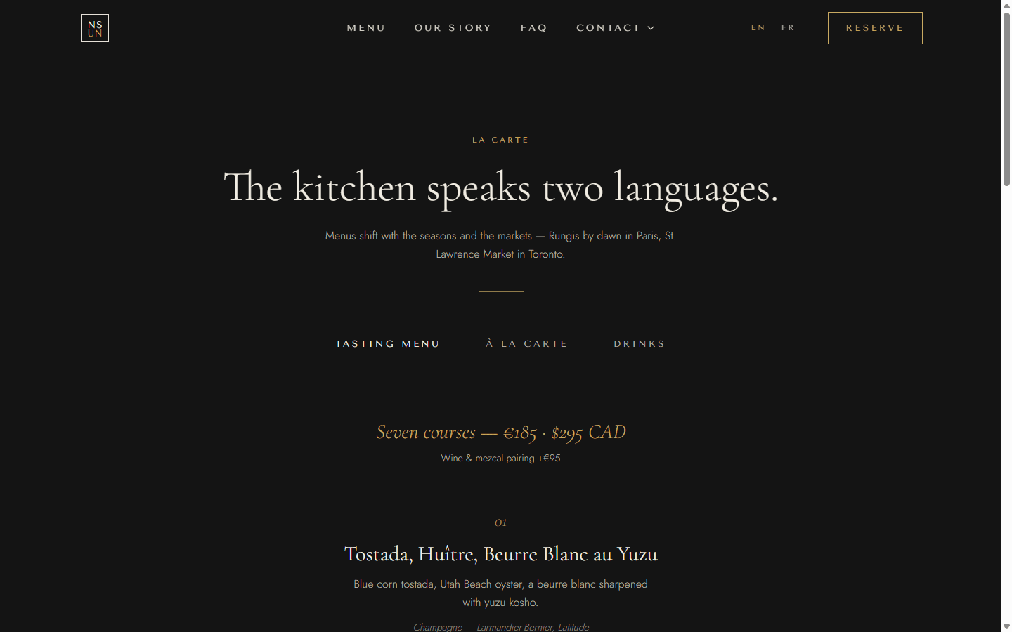
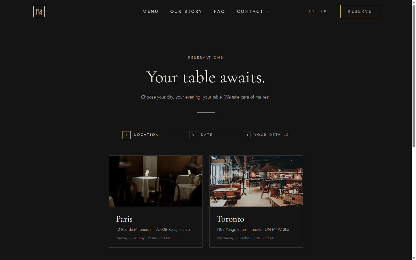
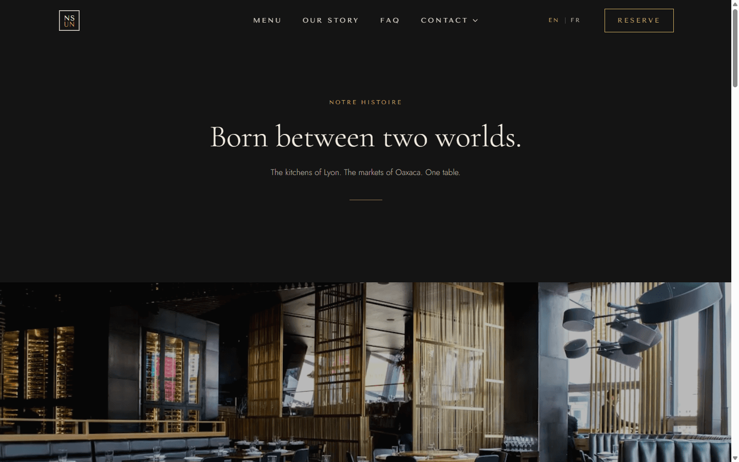
Nous Sommes Un — French for 'we are one' — is a fictional high-end restaurant split across two dining rooms, Paris and Toronto. The brief I set myself: most luxury restaurant sites load like templates, and a five-star room should never feel like one. The site's whole pitch is atmosphere plus speed — cinematic and image-heavy, but instant to load — and that tension drove every decision, from the stack to the animation budget.
A written brief before a single line of code
I treated it like a real client brief, not a portfolio sketch. I researched what current luxury restaurant sites do well and where they fail, wrote a problem statement, and only then started brainstorming the restaurant itself — the name symbolizes unity and strength. Before touching Next.js I built a design spec in Figma: typography, colour, logo, visual language. The must-haves stayed non-negotiable throughout: menu, hours, locations, and reservations findable in seconds, a hamburger nav on mobile with one-tap location/email/social, and full SEO and metadata.
- Researched competitor luxury-restaurant sites before any design work
- Figma design spec — typography, palette, logo — preceded the build
- Hard requirement: menu/hours/location/reservations findable in seconds, mobile-first nav
Directing Claude Code through a Design Intent Interview
Before Claude Code wrote anything, I gave it the full brief and ran it through a structured Design Intent Interview — iterating on UI/UX intent across many rounds of planning before any implementation. That kept the agent's output aimed at a specific feeling (atmosphere, restraint, premium pacing) instead of generic restaurant-template defaults. From there the build ran as a tracked pipeline: scaffold and dependencies, brand and content data, the shell (header, contact dropdown, mobile menu, footer, six routes), then a static home page built from 19 curated photos across five sections.
- Design Intent Interview with Claude Code before any code was written
- Tracked pipeline: scaffold → brand/data → shell → home → subpages → reservations → animation → SEO/a11y/perf
- 19 curated photos across 5 home sections
Framer Motion for UI, GSAP for the scroll choreography that needed it
The stack is Next.js (App Router) + TypeScript + Tailwind, with Framer Motion driving interface motion and GSAP ScrollTrigger brought in specifically for the pinned, scrubbed scroll sequences — Framer's scroll primitives aren't built for that. Next.js's static rendering and image optimization are why a photography-heavy dark site could still hit strong Lighthouse scores, which is exactly where most restaurant sites lose. TypeScript because the code is part of the portfolio and has to be inspectable, not just the finished page.
- Next.js App Router + TypeScript + Tailwind
- Framer Motion for UI motion, GSAP ScrollTrigger for pinned/scrubbed scroll sequences
- Static rendering + image optimization carried the Lighthouse scores
No CMS, no booking backend — on purpose
It would have been easy to over-build this: a CMS for content, a real backend for reservations. I deliberately skipped both. A spec piece doesn't need infrastructure serving an editor that doesn't exist, so the three-step reservation flow — location, then date and time slots, then guest details — runs fully client-side with a frame-draw confirmation, and the whole site ships static with nothing to break in production. The bilingual EN/FR toggle got the same restraint: real content in both languages, not a translation-library stand-in.
- 3-step reservation flow — location → date/slots → details — with a frame-draw confirmation
- Fully static: no CMS, no booking backend, nothing to break
- EN / FR language toggle with real bilingual content, not machine translation
Where the numbers actually landed
After the animation pass — Lenis smooth scroll, parallax, a pinned gallery, a preloader, reduced-motion handling, and cleaning up ghost ScrollTriggers — I ran the SEO, accessibility, and performance pass: JSON-LD, sitemap, OG image, a full keyboard sweep. Lighthouse came back 100 on accessibility, best practices, and SEO, with 96 performance on desktop and roughly 85 on mobile for a dark, image-dense site. Then real refinements — bug fixes, parallax edge cases, the EN/FR toggle — before deploying live on Vercel.
- Lighthouse: 100 a11y / best-practices / SEO, 96 perf desktop, ~85 mobile
- Lenis smooth scroll, parallax, pinned gallery, preloader, reduced-motion throughout
- Deployed live on Vercel — two fictional rooms, Paris and Toronto
- Credits
- Solo — design & direction
- AI
- Ran a Design Intent Interview with Claude Code before writing any code, then directed it through scaffolding, animation, and polish — reviewing every diff and making every UX call myself.






Premium Med Spa Website
The 6ix Aesthetics
LiveDesign + Build202698 PERF · FULLY STATIC
Outcome
A premium med spa site that reads as a “$30k agency” build — one motion identity, a single conversion path, and a fully static architecture that still hits Lighthouse 98 on desktop.
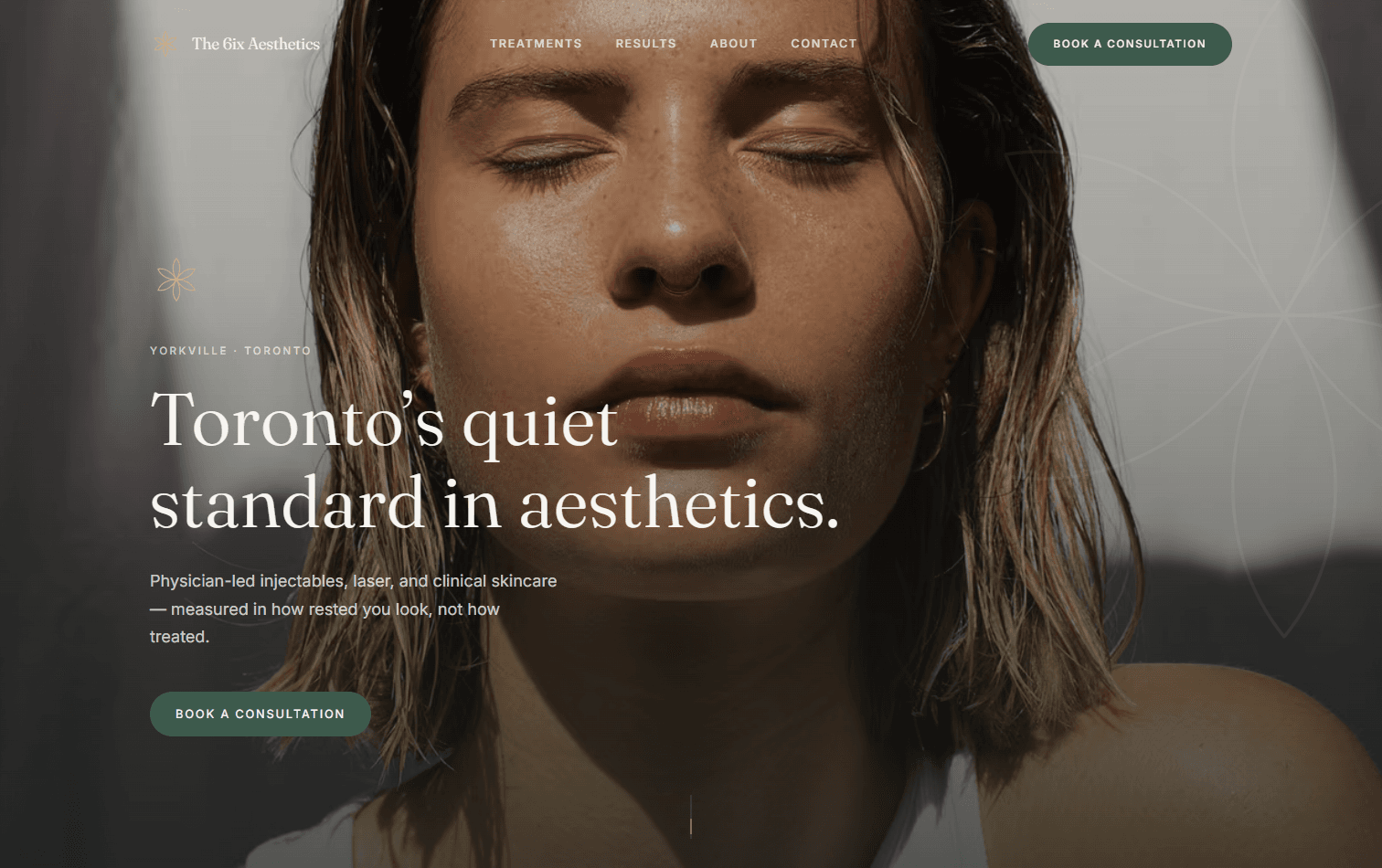
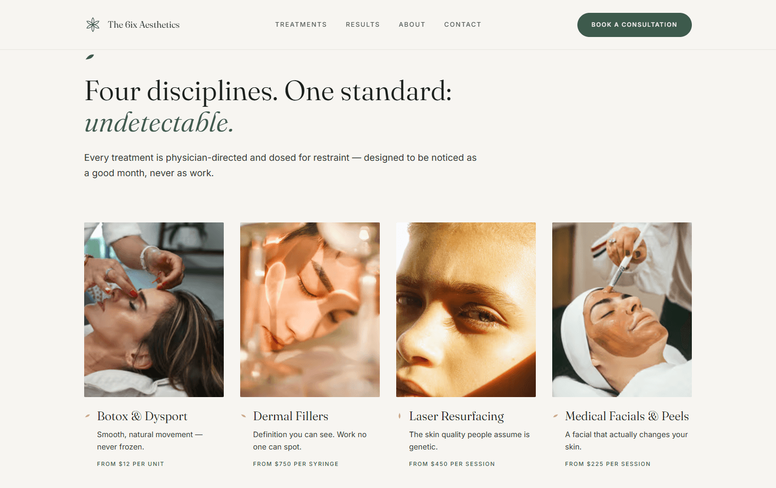
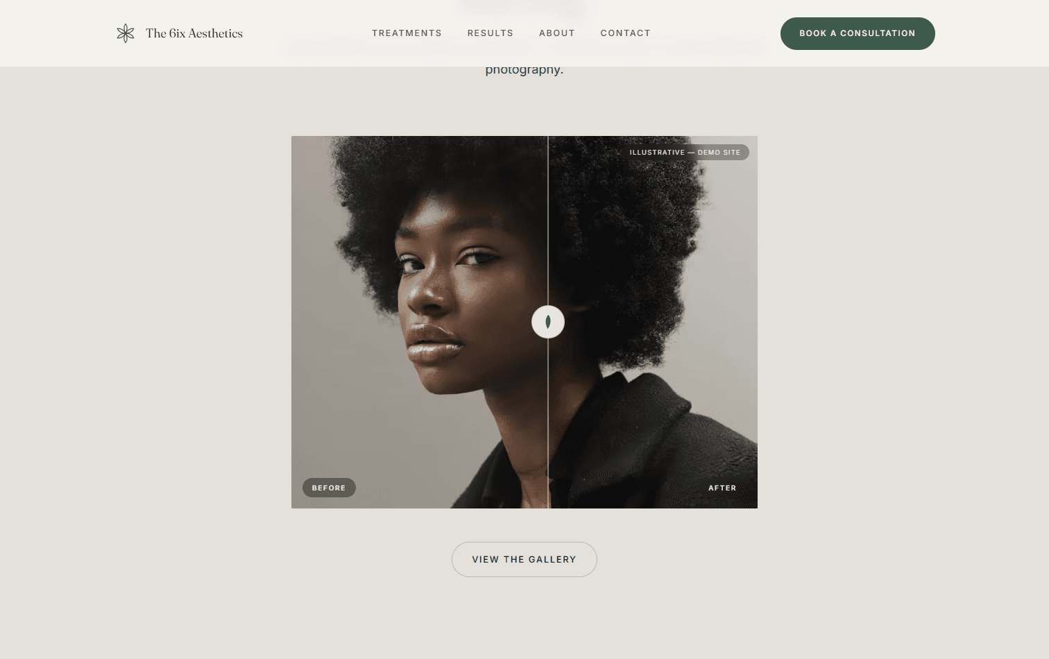
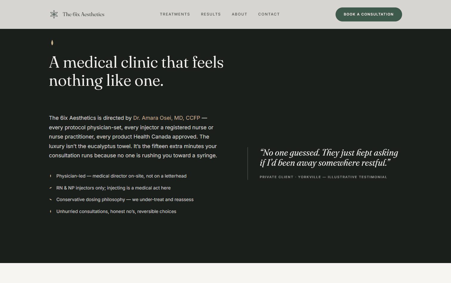
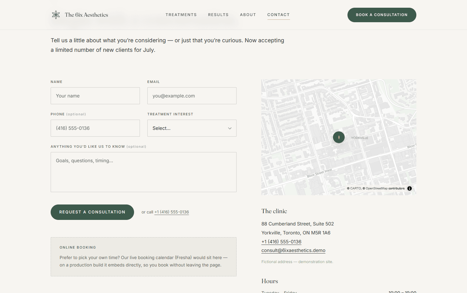
The 6ix Aesthetics is a fictional Toronto med spa, built to make one argument: premium design doesn't have to be complicated. Most med spa sites fail in one of two ways — outdated template builds heavy with teal-and-gold clichés and “20% off” urgency, or text-heavy pages that bury the booking action. Both undermine the one thing a med spa actually sells: trust in a premium, medical-grade experience. My thesis was the inverse of the template playbook — luxury is communicated through restraint.
Restraint is the whole product
Most med spa sites betray themselves with urgency — countdown timers, star-rating carousels above the fold, “20% off Botox.” That playbook sells discounts, not trust, and trust is the only thing a premium clinic has to sell. So I inverted it: quiet exclusivity instead of pressure, generous whitespace instead of dense service grids, and one calm CTA — “Book a Consultation” — instead of a wall of offers. Every decision after that was a subtraction, not an addition.
- Quiet exclusivity over urgency — no countdown timers, no “% off”
- Generous whitespace as the primary luxury signal
- A single calm CTA — “Book a Consultation” — never a discount
One motion identity, not scattered effects
The fastest way to look like a template is to bolt on unrelated animations. Instead I built a single motion language: all parallax runs on four named depth bands — background at 0.3x through floating elements at 1.15x — with the same slow easings (0.4 / 0.8 / 1.4s) everywhere. Nothing snaps or bounces; the motion is deliberate and unhurried, so it reads as part of the brand rather than decoration on top of it. GSAP + ScrollTrigger drives the scroll choreography, Framer Motion handles micro-interactions, and Lenis smooths the whole scroll.
- Four named depth bands: background 0.3x → floating 1.15x
- Consistent slow easings (0.4 / 0.8 / 1.4s) — nothing snaps
- GSAP ScrollTrigger + Framer Motion + Lenis, one coherent system
A petal motif that makes it un-templatable
One shape does the structural work across the whole site. The petal shows up as section markers, image masks, list glyphs, and the page-transition mark — all derived from the same primitive. That's what separates a real design from a template: not a unique hero image, but a consistent visual grammar repeated with intent. Once the motif is a system instead of an ornament, the design can't be lifted onto another brand without falling apart.
- Petal primitive → section markers, image masks, list glyphs, transitions
- A repeated visual grammar, not one-off decoration
Conversion architecture over decoration
Premium doesn't mean precious — the site still has to book consultations. Every page funnels to the same action, and the interactions all serve it: a draggable before/after results slider, an interactive clinic map, and a validated consultation form with a sticky CTA on mobile so booking is never more than a thumb away. The treatment copy is suitability-aware and compliance-conscious — physician-directed language, illustrative-content disclosures — because a med spa is a medical context, not just a spa.
- Single conversion path to one CTA on every page
- Draggable before/after slider, interactive clinic map, sticky mobile CTA
- Compliance-conscious, physician-directed treatment copy
Accessibility and speed are part of the luxury read
Jank breaks the premium spell, so performance was treated as a design feature, not a cleanup pass. The site ships 100% static — 15 prerendered routes with zero server functions, per-treatment pages generated at build time — on Next.js 16 (App Router, Turbopack), React 19, and Tailwind v4, with MapLibre GL powering the clinic map without an API-key dependency. Accessibility was a hard gate: WCAG 2.1 AA, full keyboard operability on the sliders and menus, and a prefers-reduced-motion path that disables every parallax while keeping the opacity fades. Lighthouse came back 98 on desktop and 88 on mobile.
- 100% static — 15 prerendered routes, zero server functions
- Next.js 16 (Turbopack) · React 19 · Tailwind v4 · MapLibre GL
- WCAG 2.1 AA, reduced-motion disables parallax, Lighthouse 98 / 88
- Credits
- Solo — design & direction
- AI
- Set the brief and the motion system, then directed Claude Code through the build — reviewing every diff and making each design and compliance call myself.
Interactive Single-Page Experience
The Field of Roses
LiveDesign + Build2026100 PERF · 100 A11Y
Outcome
A single-page designed object that ships ~9 kB of JavaScript and hits Lighthouse 100 performance / 100 accessibility — proof that one idea, told slowly, can carry a whole site.
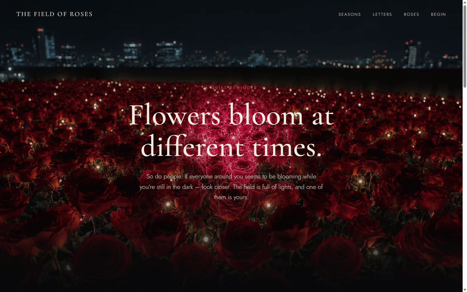
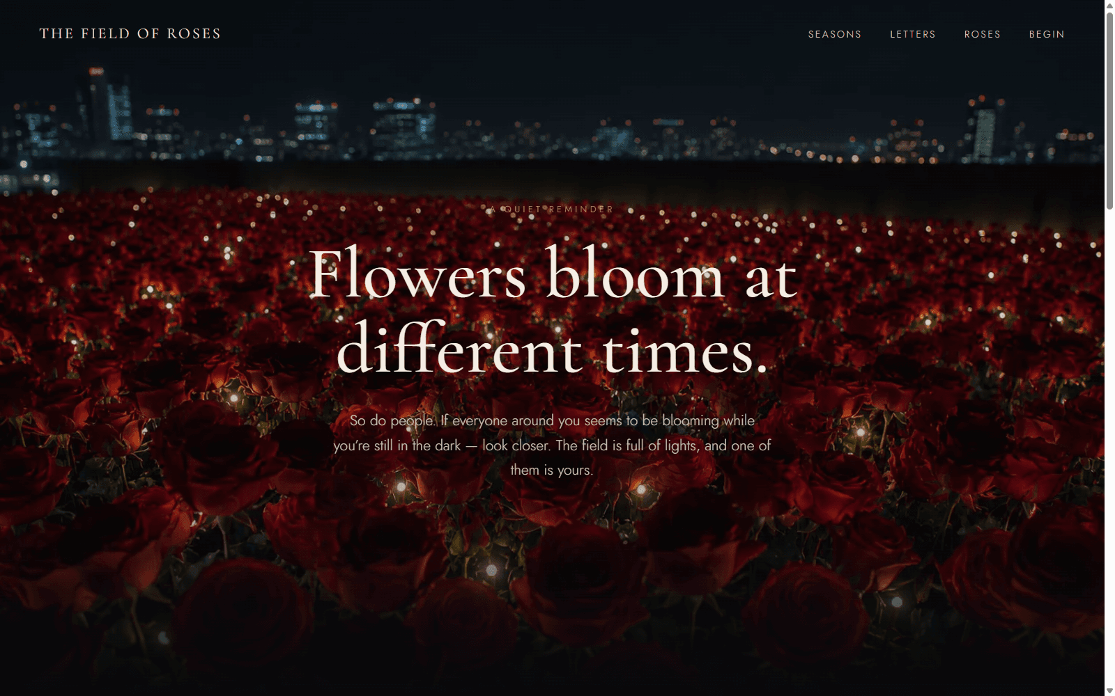
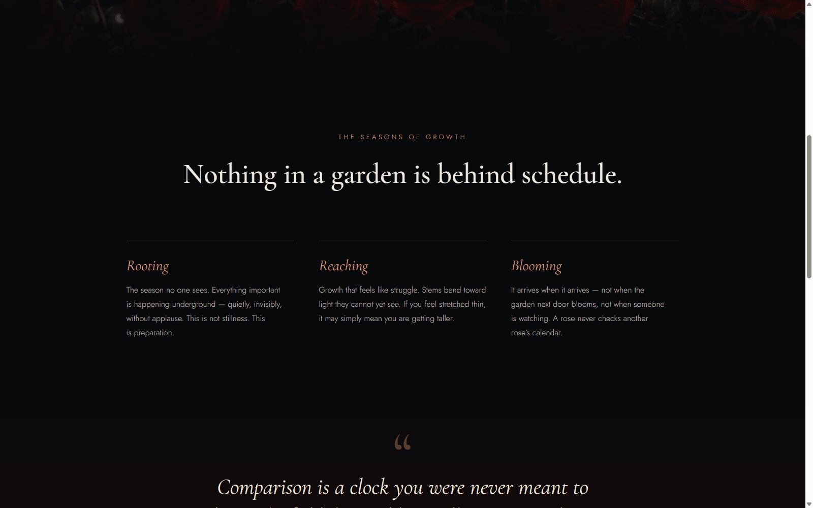
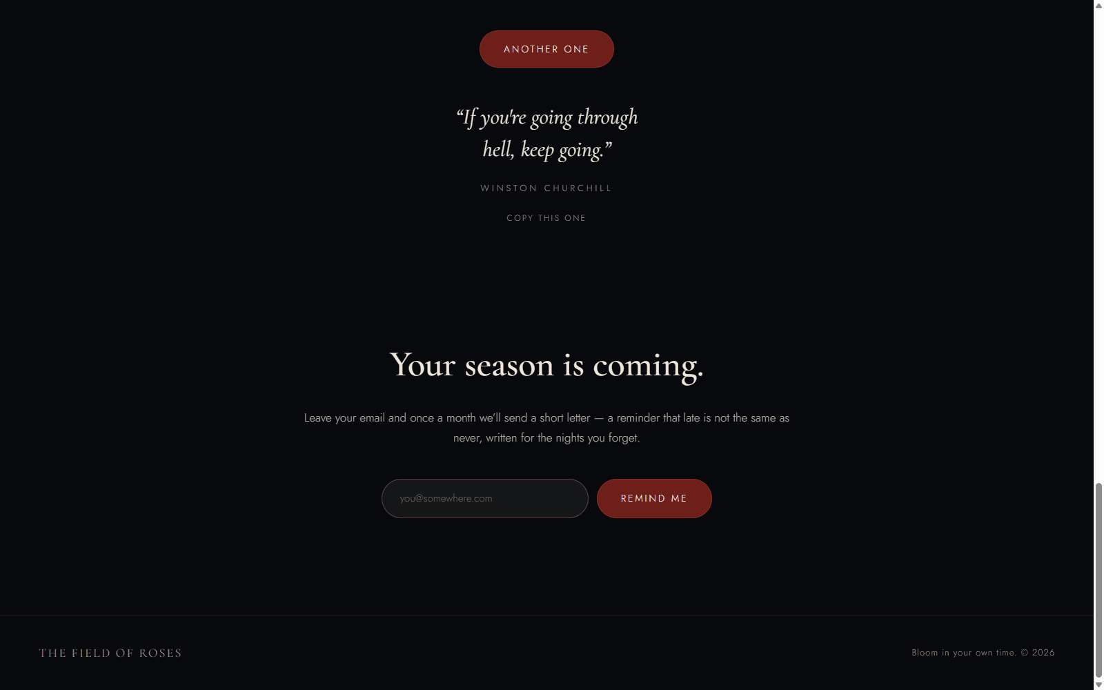
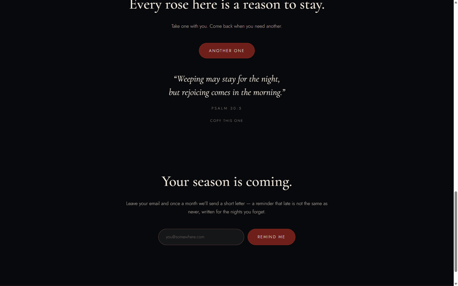
The Field of Roses is a quiet, single-page reminder that flowers — and people — bloom at different times. I built it for anyone who feels behind: a night field of roses that glows where your cursor touches it, ten hand-picked quotes on patience, and nothing else. It's a designed object rather than a product — no backend, no tracking, nothing to buy — and every technical decision serves that restraint.
A designed object, not a product
Most encouragement online arrives wrapped in a funnel — a newsletter to join, a course to buy, a metric to move. This page refuses all of it. There's no backend, no tracking, and nothing for sale; the message is the whole product. That framing set the constraint for everything downstream: if a feature didn't help say 'your time to bloom will come' more quietly or more beautifully, it didn't ship. The result is closer to a printed keepsake than a web app — a page you visit when you need it, that asks nothing back.
- No backend, no analytics, no conversion path — on purpose
- One idea, told slowly, as the entire scope
Two photographs and a mask make the signature interaction
The hero is two layered photographs of the same rose field — one dark, one lit — with a radial CSS mask that follows the pointer. As visitors move through the field, they light it up themselves: the metaphor is the interaction. There's no WebGL, no canvas, no library — just a mask-image driven by two custom properties updated on pointermove. It's the site's whole thesis in one gesture: the field is already full of light; you just haven't moved through it yet.
- Dark + lit photographs of the same field, layered
- Radial CSS mask follows the pointer — no WebGL, no canvas
- The visitor lights the field up — the metaphor is the interaction
Ten quotes, dealt like a deck
The 'Pick a rose' generator holds ten hand-picked quotes on patience and perseverance — scripture, Churchill, and other voices that have carried people through slow seasons. They deal from a shuffled deck, so nothing repeats until every quote has been seen, with a crossfade reveal and one-tap copy so a line can leave the page with you. Quote changes announce through an aria-live region, and the markup is semantic blockquote/cite — a quote generator that's honest about being one.
- Shuffled-deck dealing — no repeats until all ten are seen
- Crossfade reveal + one-tap copy
- aria-live announcements, semantic blockquote/cite markup
Dependency-light on purpose
The stack is Next.js 15 (App Router), React 19, TypeScript, and Tailwind CSS v4 — and almost nothing else. Scroll reveals run on IntersectionObserver, animations are pure CSS, and the page ships roughly 9 kB of JavaScript. Accessibility was treated as a feature, not a pass: prefers-reduced-motion support throughout, WCAG-AA contrast at every step against a near-black ground. Lighthouse came back 100 performance and 100 accessibility — the quiet page is also the fast one.
- Next.js 15 + React 19 + TypeScript + Tailwind v4
- IntersectionObserver reveals, pure-CSS animation, ~9 kB page JS
- Lighthouse 100 perf / 100 a11y, reduced-motion-aware throughout
The smallest details carry the tone
The palette is pulled from the photography itself — near-black night, deep wine reds, rose pink, warm parchment — with Cormorant Garamond as the editorial voice and Jost for structure. Then the details most visitors never notice: the tab title changes to 'The field is still here.' when you leave, a rose waits in the dev console for anyone who opens it, and even text selection and focus rings match the palette. None of it is necessary. All of it is the point — care, applied evenly, down to the corners nobody checks.
- Palette sampled from the photographs: night, wine, rose, parchment
- Cormorant Garamond for voice, Jost for structure
- Tab title, console rose, selection + focus rings — all in-world
- Credits
- Solo — design & direction
- AI
- Designed with Claude and built by directing Claude Code — reviewing every diff and making every taste call myself. The rose-field imagery was generated with GPT Image.
Client-Success Assistant for Agencies
Halix Solutions
In developmentCo-Founder & CTO2026 — PresentSLACK-FIRST · 7 INTEGRATIONS
Outcome
A Slack assistant that briefs agency account managers before every client call — built by two co-founders with me as CTO, and running in production for one internal team since September 2026.
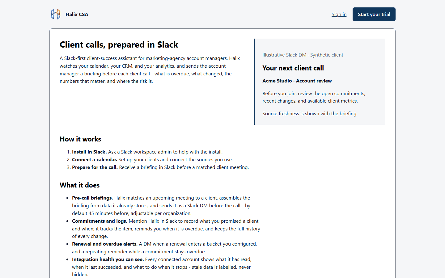
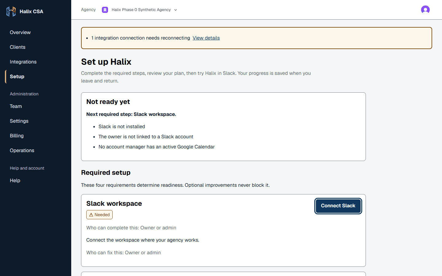
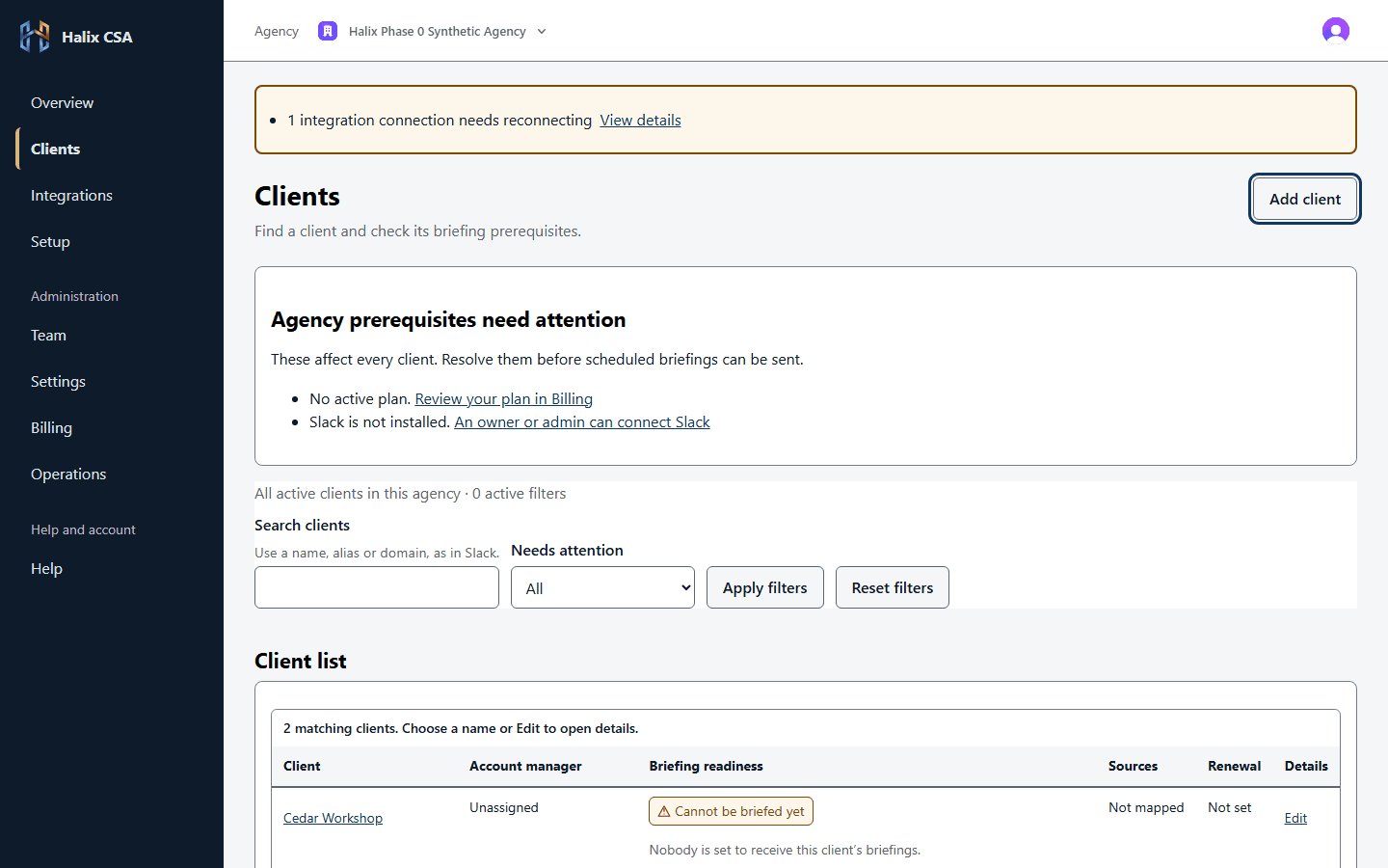
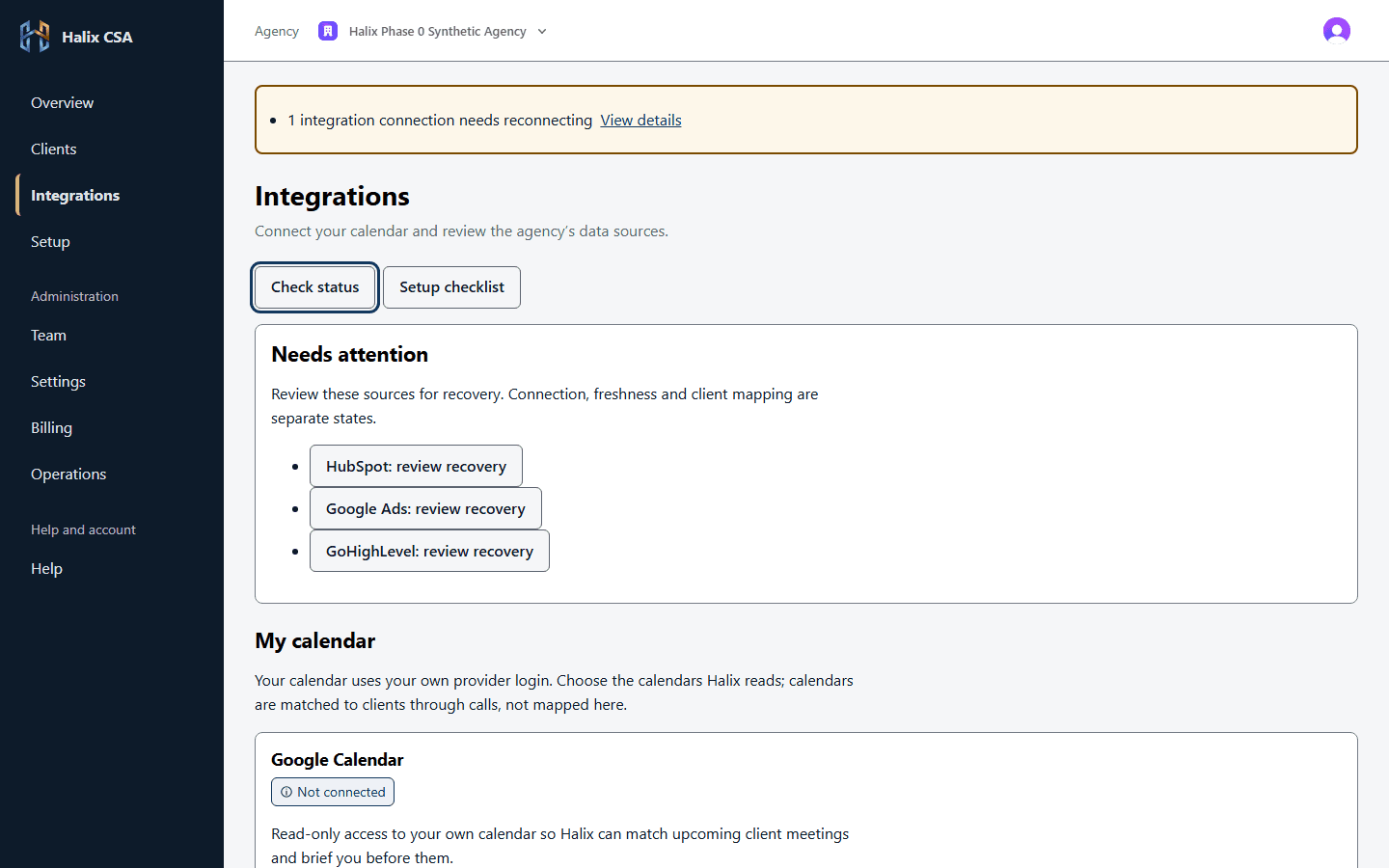
Screens from the redesigned web app, not yet released. The agency and its clients are synthetic test data — no real client appears here.
Halix Solutions is a Slack assistant for marketing-agency account managers, co-founded with Joshua Mohammed-Ali. Before a client call, an account manager has to pull context from the calendar, the CRM, the ad accounts, and memory — and under load, that step gets skipped. Halix does it for them. It reads the agency's calendar, CRM, and ad and analytics accounts, matches each upcoming meeting to a client, and DMs the account manager a private briefing 45 minutes before the call. After the call they log what they promised in Slack, and Halix follows up on overdue work and upcoming renewals. As CTO, I lead the product, the architecture, and the engineering.
A briefing in Slack beats a dashboard nobody opens
The July version of Halix was built around a client-health dashboard. A dashboard only works if someone remembers to check it, and the account managers we talked to — more than 100 of them — were already stretched across back-to-back calls. So the daily surface moved to Slack, where the team already works. The briefing arrives as a DM at the moment it's needed, before the meeting, and nobody has to go looking for it. The web app shrank to setup and admin: connecting integrations, adding clients, assigning account managers. Building Halix Slack-native was my call, and it decided most of what came after.
- Slack is the daily surface; the web app is setup and admin only
- Briefings arrive as a DM, 45 minutes before the call by default
A wrong briefing is worse than none
Every briefing starts with a match: which client is this meeting about? The matcher uses two rules and nothing else — an attendee's email domain, then the client's name in the meeting title. There's no fuzzy matching and no model involved. If two clients could fit, the meeting goes to a review queue instead of a guess. The reason is the failure mode. A guessed match sends one client's numbers and commitments to an account manager walking into a call with someone else. A missed briefing is annoying; a wrong one breaks trust in the whole product.
- Two rules only: attendee domain, then client name in the title
- Ambiguous matches go to review — never a guess
The model writes the words. A template guarantees the briefing.
A language model writes the six briefing sections — status, overdue items, what changed, numbers, risks, and sources — from data Halix has already stored. It never decides what's true. Its output is checked against a strict schema and thrown out whole if it invents a commitment, a link, or a Slack mention, or if it comes back malformed or late. There's no retry-and-repair loop. Instead, a fixed template writes the same six sections from the same data, labelled as a template. A missing model key, a model failure, and a spent daily allowance all end the same way: the account manager still gets a plain, correct briefing before the call.
- Output thrown out whole if it invents a commitment, link, or mention
- A labelled template fallback means a briefing is never skipped
- 36 of 36 briefing evaluation cases passed, on synthetic test data
Answers come from stored data, and stale data says so
Scheduled jobs sync calendar, CRM, and analytics data into Halix's own database, with read-only access to every provider. Slack replies read from that store instead of calling provider APIs live, which keeps them fast and stops a flaky third-party API from turning into a failed reply. The cost is that stored data can go stale, so staleness is part of the answer. Every source carries a freshness label from a fixed set — not connected, stale, partial, first sync pending — and a metric the provider didn't return shows as 'unavailable', never as zero. A zero would read as a real number.
- Read-only access to every provider; replies come from Halix's own store
- Missing metrics show as 'unavailable', never as zero
Four versions in six months
Halix didn't start as a Slack app. In April 2026 it was Halix Workspace, automated per-client trend reports for short-form video. By July it was a custom AI back-office studio for social-media agencies, building lead gen, outbound, and reporting systems client by client. Late in July it became a done-for-you client-retention system. In September it became what it is now: self-serve software on flat monthly tiers, built for one person — the account manager — and one moment, the minutes before a client call.
- April: trend reports · July: custom automation studio · late July: retention service · September: Slack product
- In production for one internal team since 11 September 2026; first live briefing on the 12th
- Credits
- Co-founded with Joshua Mohammed-Ali — I'm CTO and lead product, architecture, and engineering; Joshua leads customer discovery and growth.
- AI
- Wrote the codebase by directing Claude Code — owning the architecture and every product call, and reviewing every diff.


Local-First Meeting Note Taker
Honey Notes
ShippedDesign + Build20263 DAYS · 553 TESTS
Outcome
The meeting note taker built for the Halix team — macOS and Windows, with every recording staying on the machine.
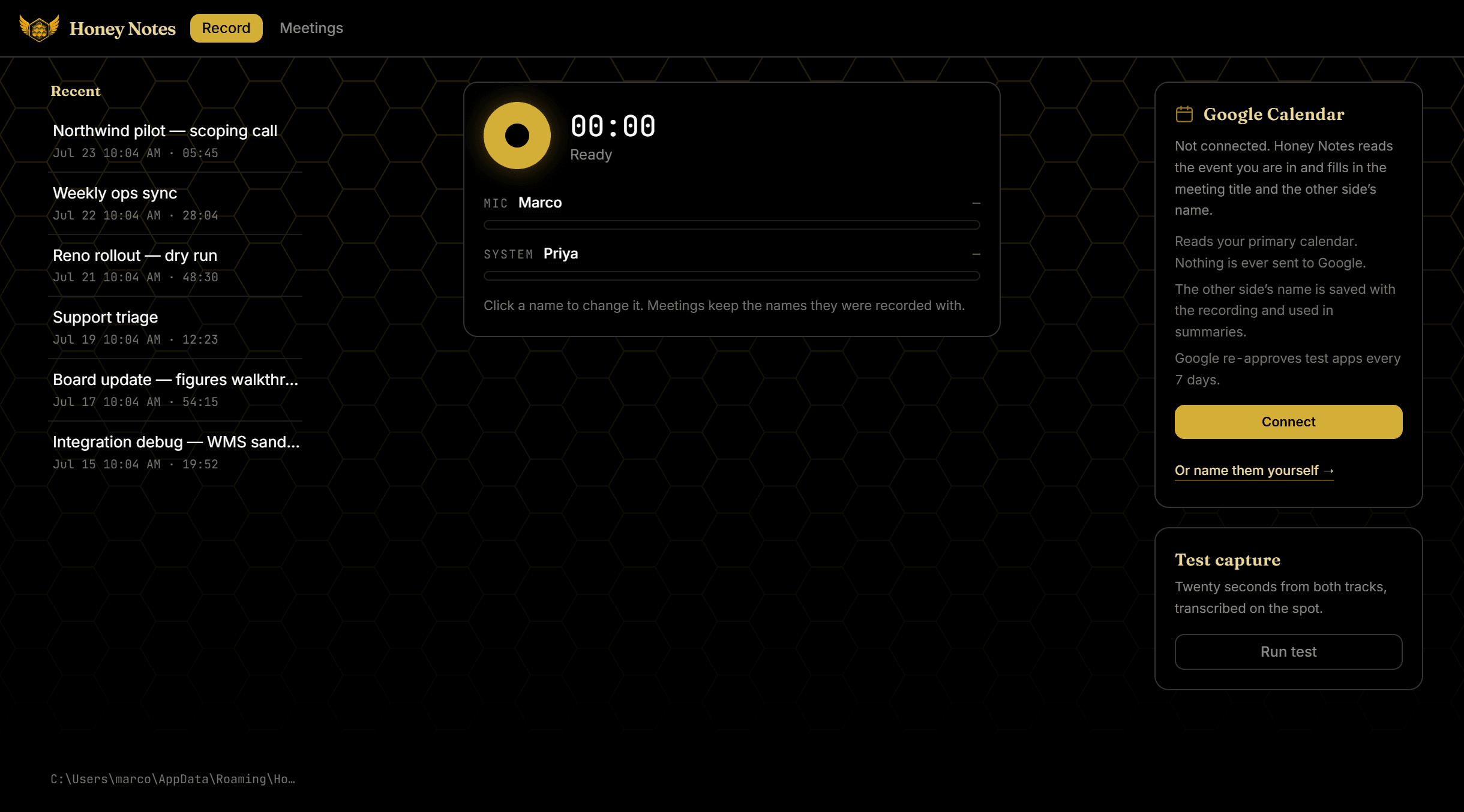
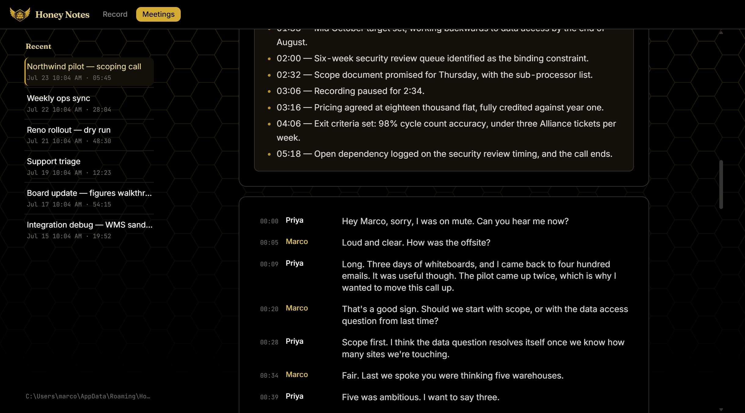
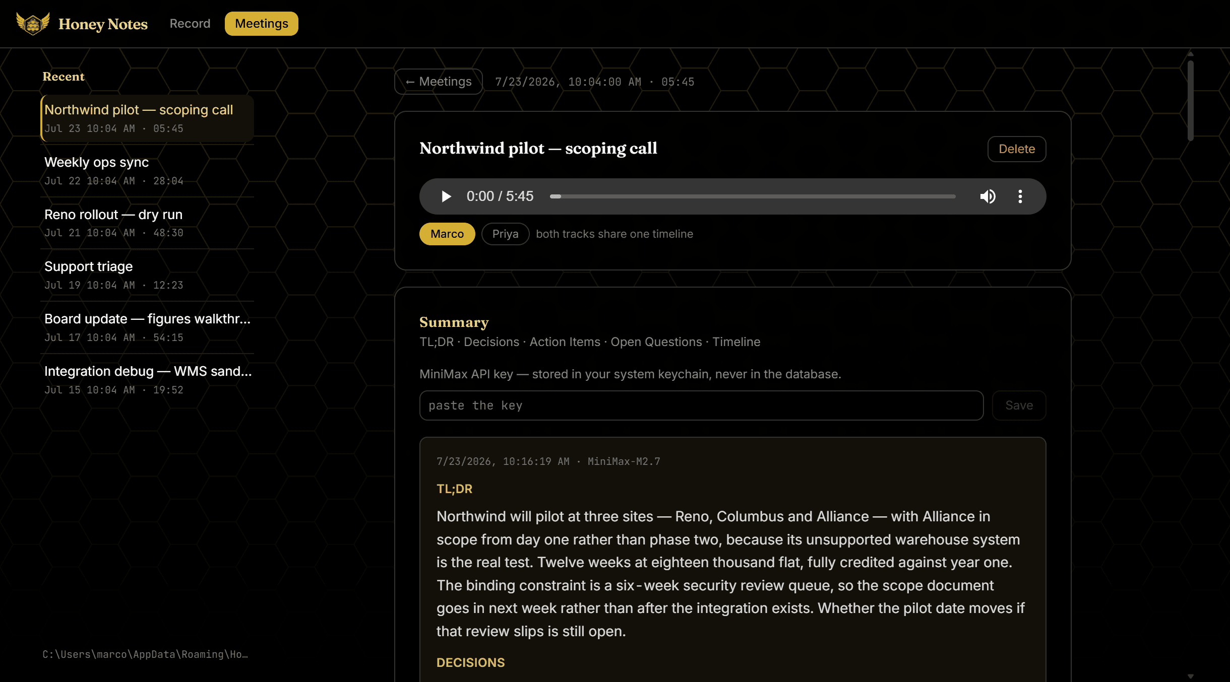
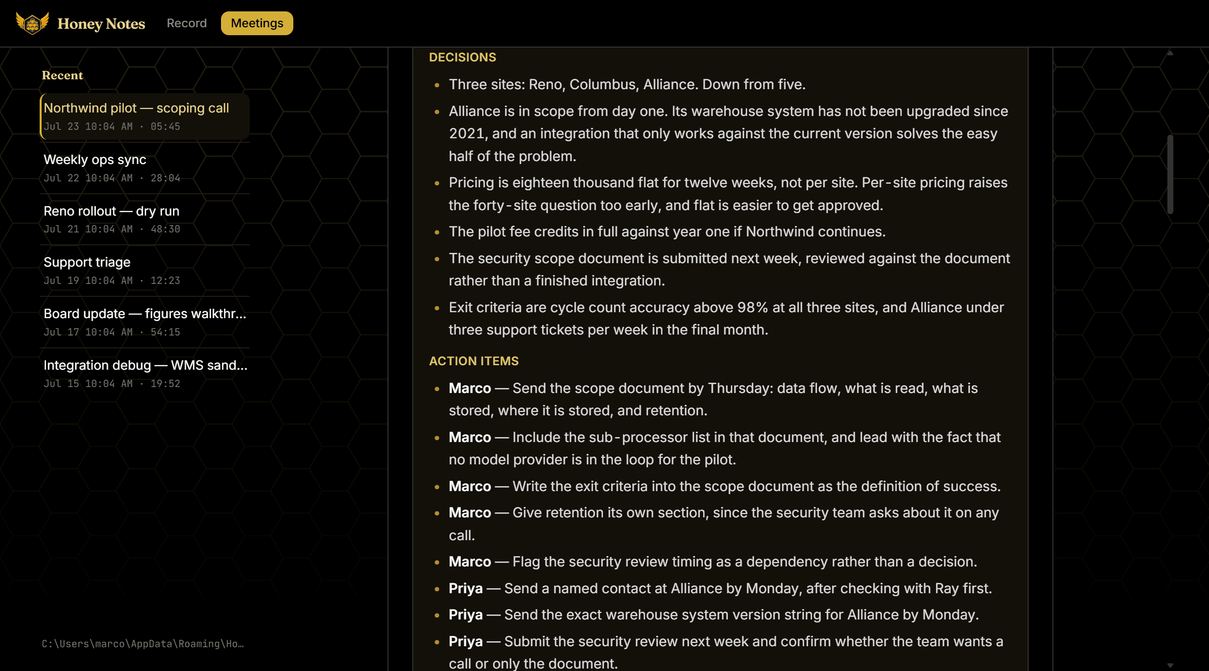
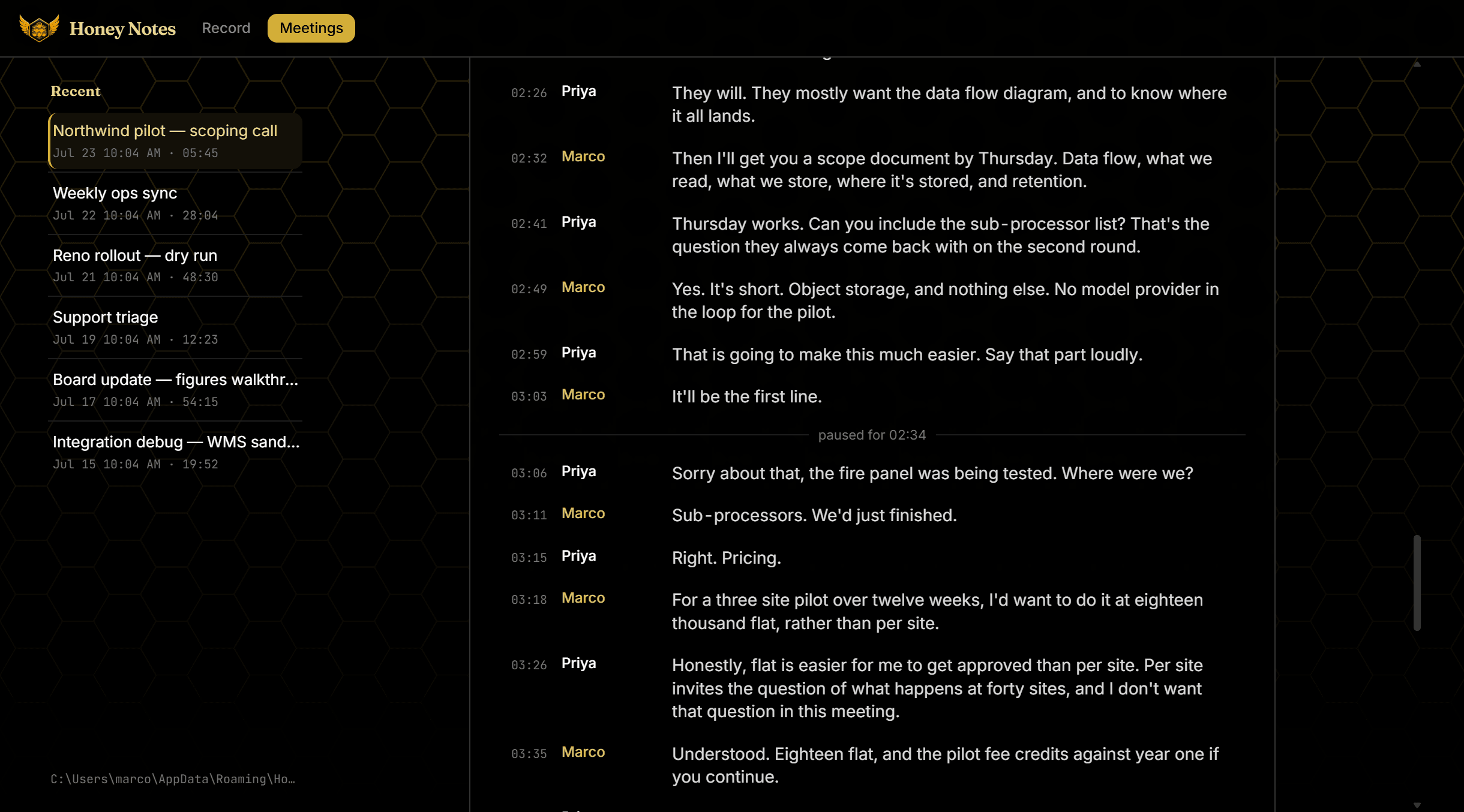
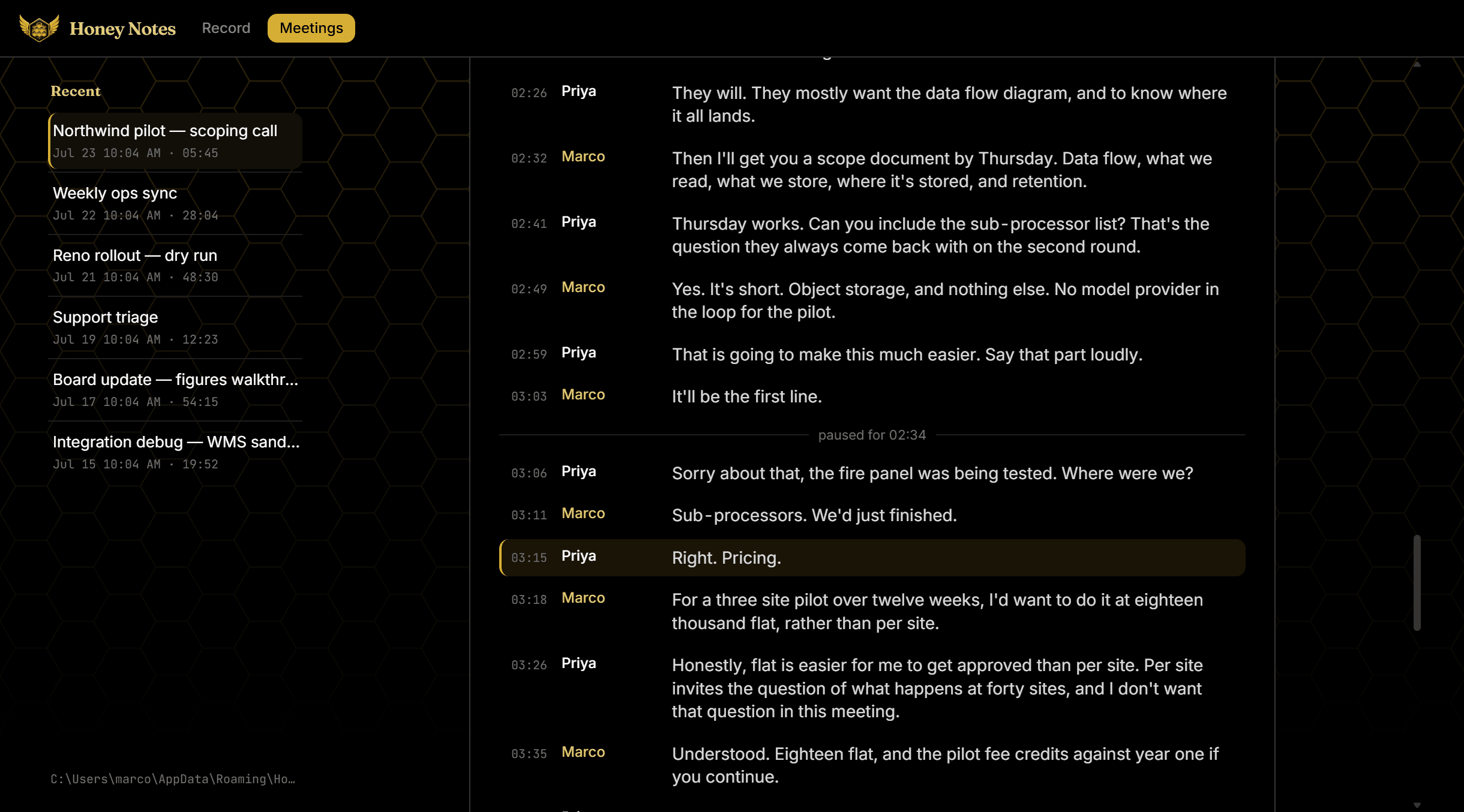
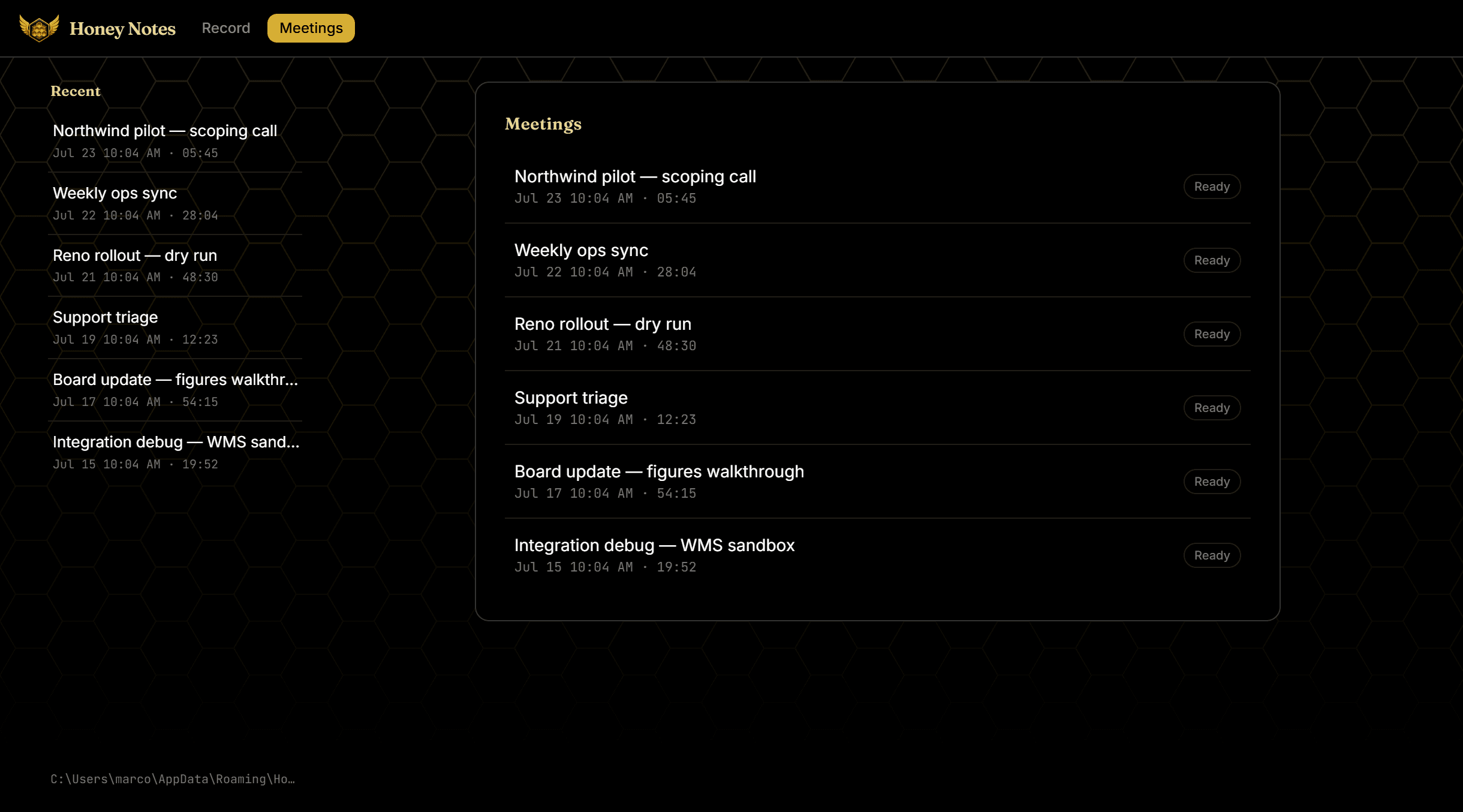
Demo data — the meeting and everyone in it are fictional; the transcripts shown were generated from synthesized speech. No real client call appears here.
Honey Notes is a local-first meeting note taker, built for Halix Solutions' own use — because paying a monthly subscription for something buildable overnight felt wrong, and because a wanted feature should ship the same day, not sit on someone else's roadmap. No bot joins the call. It records both halves of the conversation itself — the mic on one track, the other side arriving through the speakers on another — runs whisper.cpp on-device, and summarizes only when asked. One design decision carries the whole app: keep the two sides separate, and speaker attribution comes free.
Three days, because the alternative was a subscription
Halix runs on client calls, and a call that isn't captured is a set of decisions that exist only in memory. The market answer is a monthly fee for a bot that joins your meetings. I built the alternative instead: 26–28 July, 25 commits. Day two ended with a feature-complete v1 — record, pause, transcribe, play back, summarize. Day three added the Windows port and Google Calendar. What keeps three days from reading as a warning is the test suite: 37 files, nearly a line of test for every line of source.
- Feature-complete v1 on day two — record, pause, transcribe, play back, summarize
- Day three: the Windows port and Google Calendar
- Internal tool for Halix Solutions — nothing for sale
Two tracks captured separately — speaker attribution comes free
Honey Notes never joins a call as a bot. It sits on the machine and captures the meeting the way the machine already hears it: the microphone as one track, the system audio — the other side's voice coming out of the speakers — as a second. The two are never mixed, and that does the work a diarization model normally does: every segment already knows who said it, because it knows which file it came from. On stop, each WAV runs through whisper.cpp locally and the two segment lists merge by timestamp into one interleaved conversation.
- Mic and system audio captured separately, never mixed — no diarization model anywhere
- Two segment lists merged by timestamp into one interleaved conversation
- Names snapshot onto the meeting row before the first sample — a rename never rewrites an old transcript
The same recording, captured backwards on each platform
System audio is the hard half, and each OS demanded the opposite answer. On macOS, a Core Audio tap captures it in the main process — Chromium's loopback path returns pure silence there (electron#49607). On Windows, WASAPI loopback through Chromium's getDisplayMedia works, but only in the renderer. So the two platforms run reverse architectures: main captures on one, the window captures on the other. One function in the main process picks the strategy and tells the renderer which side it owns. Both paths append to the same WAV; pause, transcription, and the merge never know the difference.
- macOS: Core Audio tap in the main process; Windows: WASAPI loopback in the renderer
- One function in main decides the strategy — the renderer is told, never guesses
- Both paths write the same WAV, so everything downstream is shared
Privacy by architecture, not policy
Audio never leaves the machine: transcription is whisper.cpp running on-device. The transcript crosses the network exactly once — the only call that ever carries meeting data, to MiniMax, and only on an explicit Summarize press, behind a one-time consent gate enforced in the main process so a renderer bug can't skip it. Google Calendar is read-only, and every Google call lives in main, which is why the renderer's CSP names no Google origin. If a change ever needed one added, that's proof a call leaked into the window — the CSP is a tripwire, not configuration.
- Meeting data crosses the network exactly once — MiniMax, on an explicit Summarize press
- Consent gate enforced in the main process — a renderer bug can't skip it
- Renderer CSP names no Google origin — a tripwire, not config
A summary that invents a person is refused
Summaries come back in five fixed sections — TL;DR, Decisions, Action Items, Open Questions, Timeline — and an empty section says “None”, so a missing heading always means a malformed response. Then the check that matters: every action item must be owned by one of the two speakers in that meeting. An owner outside that set means the model invented a third person — the hallucination that actually does damage in a meeting summary, because a fabricated name reads exactly as plausibly as a real one. That response is refused, not stored.
- Every action item must be owned by one of the meeting's two speakers
- An owner outside that set means a hallucinated person — refused, not stored
- Credits
- Solo — built as an internal tool for Halix Solutions
- AI
- Designed the system and directed Claude Code through the entire build — reviewing every diff and making every architecture and product call myself.


Portfolio Site
This Portfolio
LiveDesign + Build2026DESIGN · BUILD
Outcome
A motion-led site that ships at 0 WCAG A/AA violations (axe-verified) and stays fully reduced-motion-aware — proof of the craft it claims.
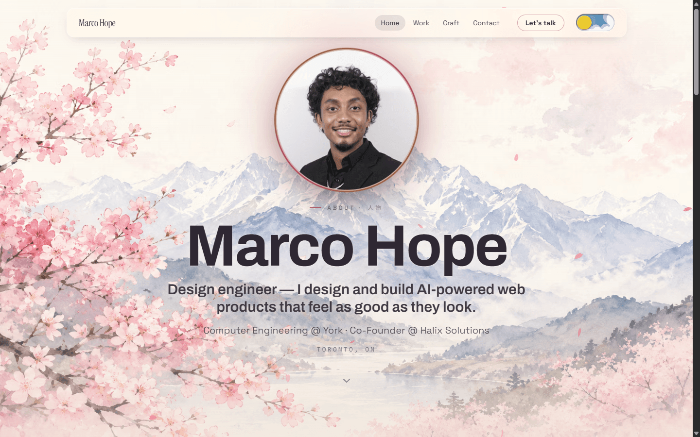
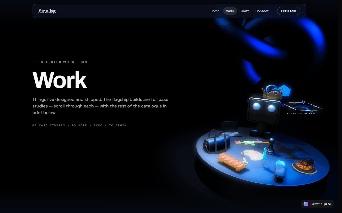
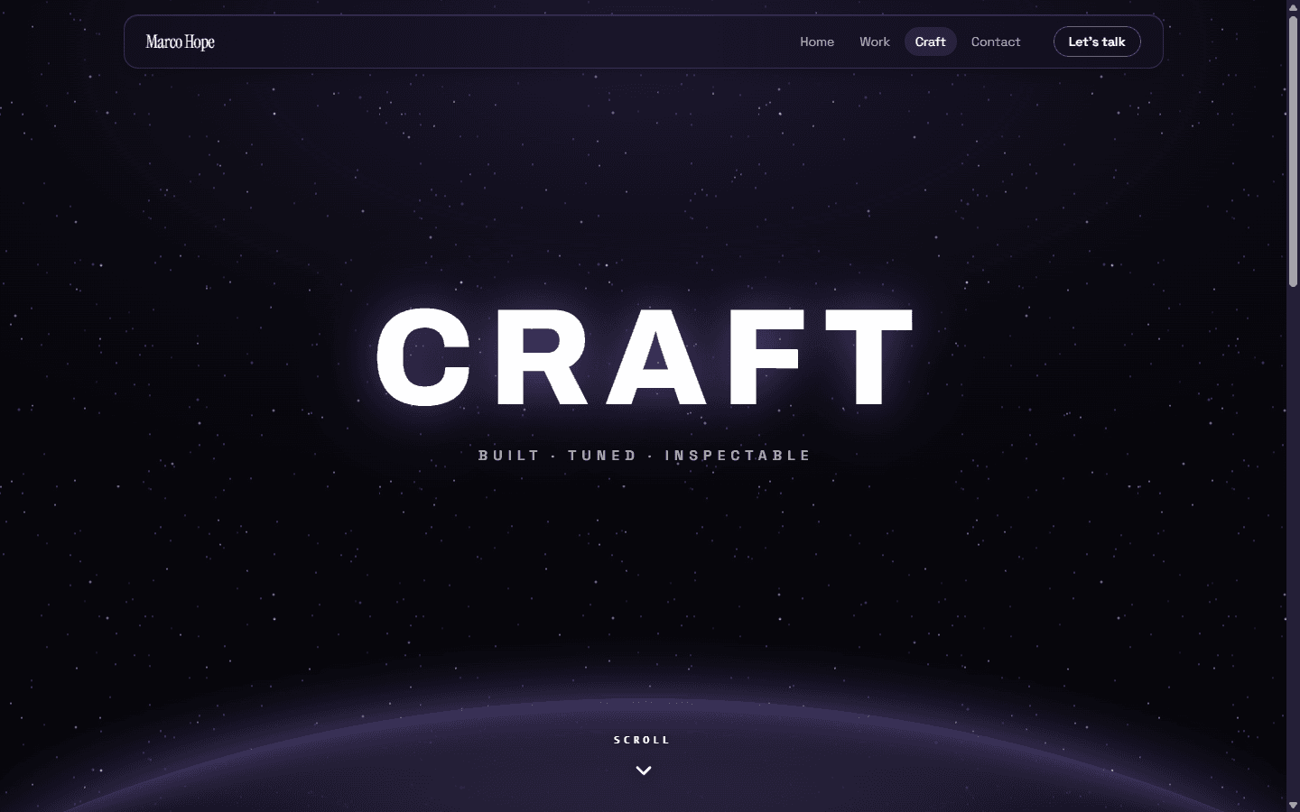
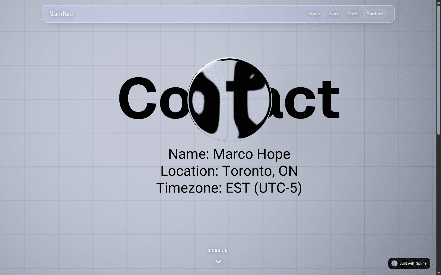
This is the site you're reading. A motion-led portfolio I designed and built from scratch, with one job: prove the craft it claims instead of describing it. If I say I have a UI/UX eye and can choreograph front-end motion, the site itself has to be the evidence. So every page is its own themed world — sakura day and night, work, contact, craft — sharing one token set, with interactive 3D heroes and scroll-driven motion. Being my own client meant no brief to hide behind, and no one else to blame for a lazy decision.
A portfolio has to pass its own audition
A portfolio claiming UI/UX sensibility and front-end motion can't just list those skills — the page has to be the demo. That set the bar: the build is the argument. I was also my own client, which cut both ways. Total freedom, and nobody else's brief to blame when a decision came out lazy. Every spacing choice, every transition, every theme was a judgment call I had to defend to myself. It sharpened my taste and forced one question onto each interaction — does this earn its place, or is it motion for its own sake? Cuts came easy once that was the test.
One token set drives five themed worlds
Each page is its own world — sakura day and night, work, contact, craft — but they aren't five separate builds. They share a single token set defined CSS-first in Tailwind v4, so a theme is a swap of variables, not a fork of the styling. That keeps the system honest: colour, type, and spacing stay consistent while the mood changes per route. Next.js App Router structures the pages; the theme layer rides on top. The payoff is range without drift. Each route can take its mood somewhere new while still reading as the same site by the same hand.
- Tailwind v4, CSS-first tokens — one source of truth
- Day and night sakura variants from the same variables
- Per-route themes, not per-route rewrites
Motion only where it earns its keep
Motion is choreographed in GSAP and ScrollTrigger, not sprinkled on. Scroll drives scene transitions; the work page pins into a horizontal slider; reveals stagger in as sections enter view. Loading isn't dead time either — themed liquid-glass loaders hold the frame while interactive Spline 3D scenes spin up as page heroes. Those scenes react to the cursor with distortion, so the hero feels handled rather than decorative. The rule throughout: every animation answers to the content. If a transition doesn't clarify where you are or where you're headed, it gets cut. That's the line between a site that moves and a site that's just busy.
- Pinned horizontal work slider via ScrollTrigger
- Cursor-reactive Spline 3D heroes
- Liquid-glass loaders themed per page
Reduced-motion and no-JS are first-class paths
None of the motion is allowed to trap anyone. Every overlay has a no-JS escape hatch, navigation works from the keyboard, and a reduced-motion path runs throughout — not a stripped fallback, a deliberate alternate. The site also respects prefers-reduced-transparency, so the liquid-glass surfaces dial down for people who need them to. I treated accessibility as part of the design, not a compliance pass at the end. A motion-led site is exactly the kind that breaks for people on the edges, so the edges got designed first — alongside the showpiece interactions, not bolted on after them.
- Reduced-motion paths as deliberate alternates
- Keyboard-friendly navigation, no-JS escape hatches on every overlay
- Respects prefers-reduced-transparency
I made every call; agents wrote the code
Honest scope: I designed this and directed AI coding agents (Claude Code) to build it. The architecture, the motion design, the theme system, and every taste call are mine — the agents typed under direction. That's how I work now, and it's the point, not a caveat. Directing the build well takes its own skill: holding the whole system in your head, specifying intent precisely, and rejecting output that's close-but-wrong. The design decisions are where the craft lives, and those didn't get delegated. What you're looking at is that loop made visible — me deciding, agents executing, me judging the result, then doing it again.
- Credits
- Solo — design & direction
- AI
- Designed the site and directed Claude Code to write the build — owning the architecture, motion design, theme system, and every taste call.
Shopify UX / SEO
Minoa Home
ShippedUX/UI Design & Digital Marketing Intern2024 – 2025~13% ORGANIC TRAFFIC
Outcome
Raised organic traffic by roughly 13% with on-page SEO, and designed the Klaviyo newsletter assets for a sustainable-luxury Shopify brand.


Minoa Home is a sustainable-luxury brand selling to wholesale buyers and retail shoppers from one Shopify storefront. As a UX/UI design and digital-marketing intern, I worked inside an established brand rather than a blank canvas: study how competitor storefronts handle UX and UI, design the newsletter assets that bring people back to the store, and improve how the store shows up in search. Every change had to respect Minoa's existing fonts, colours, and tone.
Competitor storefronts showed what to borrow and what to avoid
Before recommending anything, I compared UX flows and UI consistency across competitor Shopify storefronts. Minoa sells to wholesale buyers and retail customers, and the two want different things — B2B wants catalogue clarity and trust signals, B2C wants story and desire. Studying how other stores handled both paths turned 'make it feel more premium' into specific patterns to borrow or avoid, taken from stores selling to the same customers.
- UX flow and UI consistency compared across competitor Shopify stores
- Both the wholesale (B2B) and retail (B2C) journeys in view
On-page SEO raised organic traffic ~13%
Search was the other half of the job. I used SEMRush to see what Minoa's pages should rank for and Google Search Console to see how they were actually performing, then worked through the on-page fixes — titles, descriptions, headings, and content that matched what people searched for. Organic traffic rose by roughly 13%. None of it touched the brand; it made the existing store easier to find.
- SEMRush for keyword research; Search Console for real performance
- Organic traffic up roughly 13%
On-brand assets, and a guide so the next person could make them
I designed the Figma assets for Minoa's Klaviyo newsletter campaigns, alongside reels and promotional stills, each held to the brand's fonts, colours, and tone so the whole funnel reads as one brand. Then I wrote a newsletter guide that onboards new marketing recruits and standardises how the team produces content. An intern's work tends to leave with the intern. Documentation is what lets the next person hit the same bar.
- Klaviyo newsletter assets designed in Figma
- Newsletter guide written to onboard new recruits
- Credits
- Embedded on Minoa's marketing team
Desktop Automation
Deeds Leisure — Lead-Gen Tool
ShippedSoftware Engineer InternJan – Mar 2026~75% TIME SAVED
Outcome
Cut the sales team's manual prospecting time by roughly 75% — and handed them a tool they could run without engineering support.
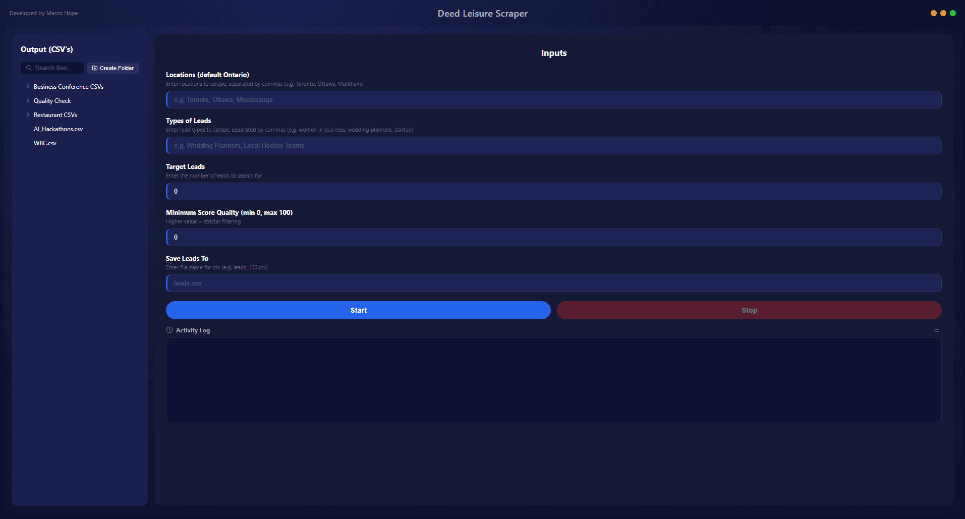
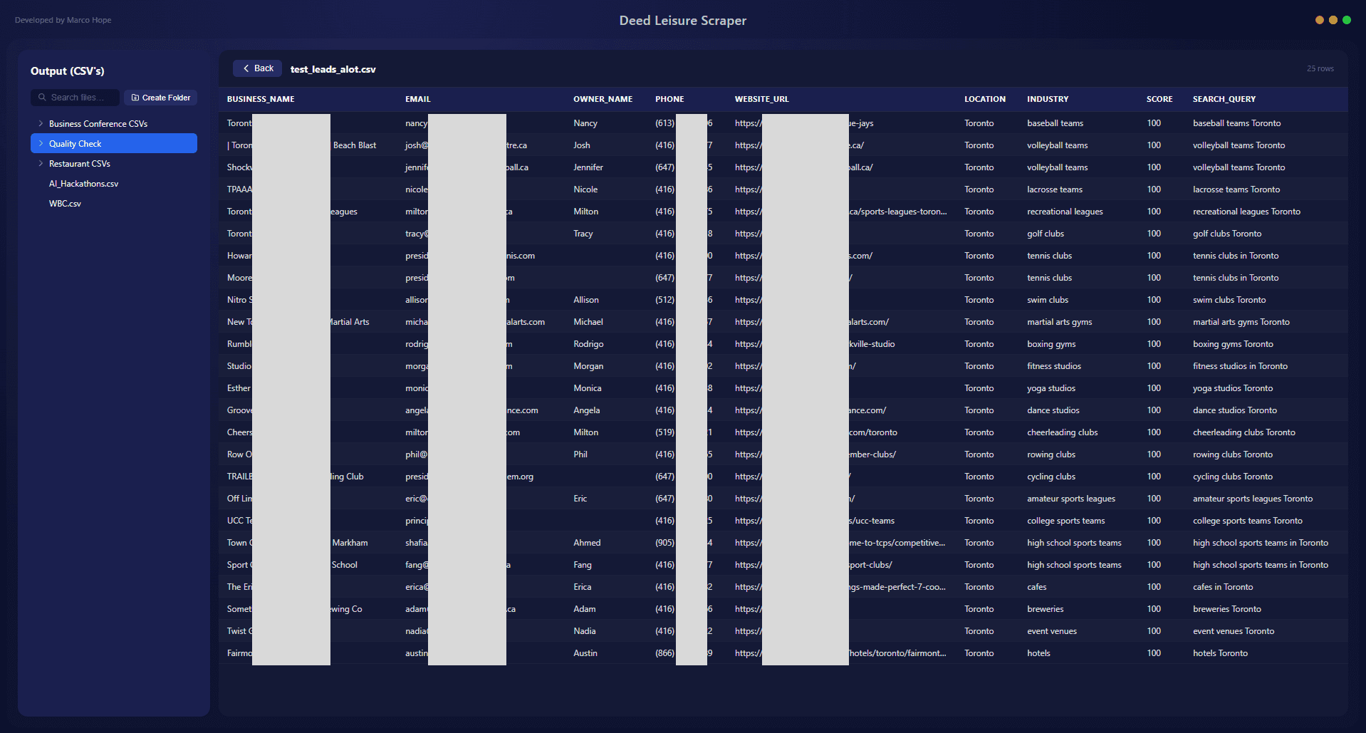
Deeds Leisure's sales team prospected by hand — searching city by city, category by category, copying out contact details one search at a time. As a software engineer intern, I built the tool that replaced that grind: a desktop app that researches outreach targets across 25 Ontario cities and 43 business categories on demand. The people running it weren't technical, so it had to feel like a product, not a script. I sat on the sales team it was built for, which kept the requirements honest and the test loop short.
I was a user of the tool I was building
I sat on the sales team as well as building for it, and that turned out to be the point. I did the manual prospecting myself before I automated it, so I knew which steps were tedious and which fields the team actually used. Outreach research meant working through 25 Ontario cities and 43 business categories, one search at a time. Building for a team I sat on meant I could test a change at my own desk and watch whether it saved real minutes, not hypothetical ones. The estimated ~75% cut in prospecting time came from removing work I had personally felt.
- Built the tool while doing the manual prospecting myself
- ~75% less manual prospecting time (estimated)
A thousand lines of Python, no API to lean on
There was no clean data source to call, so the pipeline assembled one. Roughly a thousand lines of Python: DuckDuckGo Search to surface candidate businesses per city and category, BeautifulSoup to parse the pages it found, and regex to pull contact details out of messy HTML. Each city–category pair fanned out into its own search, then folded back into one lead list. Scraping is brittle by nature — layouts vary, pages break — so much of the work was the unglamorous part: handling the cases where extraction returned nothing useful and keeping the run moving instead of stalling on a bad page.
- ~1,000-line pipeline: DuckDuckGo Search + BeautifulSoup + regex
- Fan-out across 25 cities x 43 categories, merged into one list
Scoring kept the team from chasing dead ends
A raw scrape gives you volume, not quality — and a sales team that wastes calls on bad leads stops trusting the tool. So the pipeline scored every lead 0–100 instead of dumping everything it found. Franchises got filtered out, since national chains weren't the target. A domain blocklist caught directories, aggregators, and other noise that kept resurfacing. The point wasn't a perfect score; it was a list someone could work top-down with reasonable confidence. Ranking changed how the output got used — the team could trust the top of the list and stop second-guessing every row.
- 0–100 lead quality scoring
- Franchise filtering + domain blocklisting
The scraper only counted once someone could double-click it
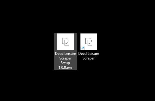
A Python script is useless to a sales team that won't open a terminal. So I designed a frameless desktop UI in Figma and wrapped the pipeline in an Electron app, with Node bridging the interface to the Python underneath. Then I packaged it as a .dmg and .exe with PyInstaller and electron-builder, so installing it was a double-click on whatever machine someone had. That last mile taught me the most: the engineering was only as valuable as the moment a non-technical colleague could run it alone, without me on a call walking them through Python. Packaging was the feature.
- Frameless desktop UI designed in Figma, wrapped in Electron
- Shipped as .dmg and .exe via PyInstaller + electron-builder
- Credits
- Solo build, embedded on the sales team