PF-003 · Portfolio Site
This Portfolio
LiveDesign + Build2026DESIGN · BUILD
Outcome
A motion-led site that ships at 0 WCAG A/AA violations (axe-verified) and stays fully reduced-motion-aware — proof of the craft it claims.
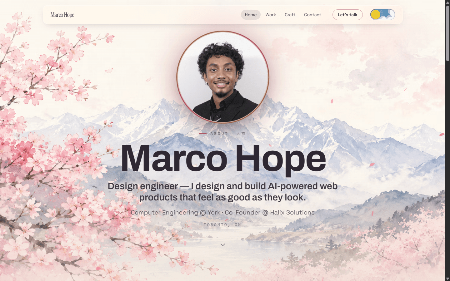
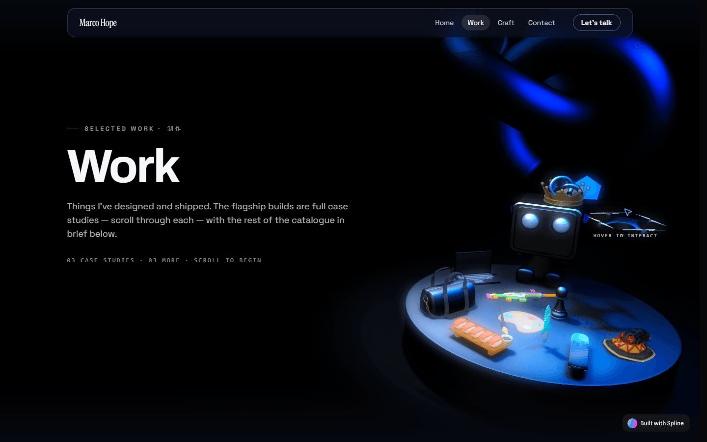
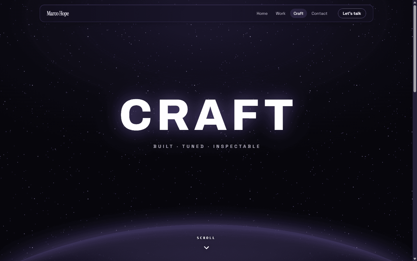
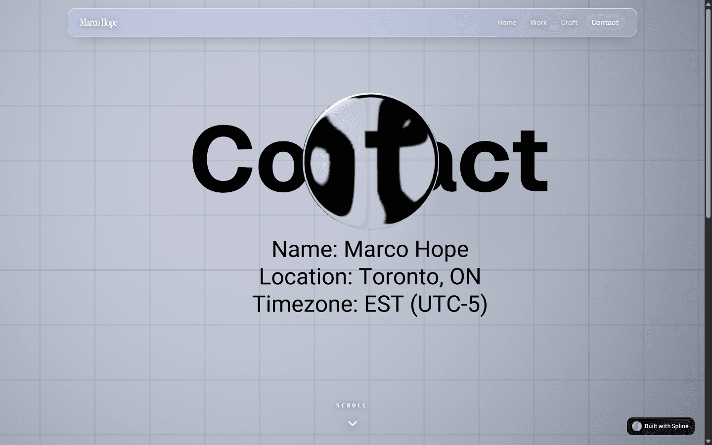
This is the site you're reading. A motion-led portfolio I designed and built from scratch, with one job: prove the craft it claims instead of describing it. If I say I have a UI/UX eye and can choreograph front-end motion, the site itself has to be the evidence. So every page is its own themed world — sakura day and night, work, contact, craft — sharing one token set, with interactive 3D heroes and scroll-driven motion. Being my own client meant no brief to hide behind, and no one else to blame for a lazy decision.
A portfolio has to pass its own audition
A portfolio claiming UI/UX sensibility and front-end motion can't just list those skills — the page has to be the demo. That set the bar: the build is the argument. I was also my own client, which cut both ways. Total freedom, and nobody else's brief to blame when a decision came out lazy. Every spacing choice, every transition, every theme was a judgment call I had to defend to myself. It sharpened my taste and forced one question onto each interaction — does this earn its place, or is it motion for its own sake? Cuts came easy once that was the test.
One token set drives five themed worlds
Each page is its own world — sakura day and night, work, contact, craft — but they aren't five separate builds. They share a single token set defined CSS-first in Tailwind v4, so a theme is a swap of variables, not a fork of the styling. That keeps the system honest: colour, type, and spacing stay consistent while the mood changes per route. Next.js App Router structures the pages; the theme layer rides on top. The payoff is range without drift. Each route can take its mood somewhere new while still reading as the same site by the same hand.
- Tailwind v4, CSS-first tokens — one source of truth
- Day and night sakura variants from the same variables
- Per-route themes, not per-route rewrites
Motion only where it earns its keep
Motion is choreographed in GSAP and ScrollTrigger, not sprinkled on. Scroll drives scene transitions; the work page pins into a horizontal slider; reveals stagger in as sections enter view. Loading isn't dead time either — themed liquid-glass loaders hold the frame while interactive Spline 3D scenes spin up as page heroes. Those scenes react to the cursor with distortion, so the hero feels handled rather than decorative. The rule throughout: every animation answers to the content. If a transition doesn't clarify where you are or where you're headed, it gets cut. That's the line between a site that moves and a site that's just busy.
- Pinned horizontal work slider via ScrollTrigger
- Cursor-reactive Spline 3D heroes
- Liquid-glass loaders themed per page
Reduced-motion and no-JS are first-class paths
None of the motion is allowed to trap anyone. Every overlay has a no-JS escape hatch, navigation works from the keyboard, and a reduced-motion path runs throughout — not a stripped fallback, a deliberate alternate. The site also respects prefers-reduced-transparency, so the liquid-glass surfaces dial down for people who need them to. I treated accessibility as part of the design, not a compliance pass at the end. A motion-led site is exactly the kind that breaks for people on the edges, so the edges got designed first — alongside the showpiece interactions, not bolted on after them.
- Reduced-motion paths as deliberate alternates
- Keyboard-friendly navigation, no-JS escape hatches on every overlay
- Respects prefers-reduced-transparency
I made every call; agents wrote the code
Honest scope: I designed this and directed AI coding agents (Claude Code) to build it. The architecture, the motion design, the theme system, and every taste call are mine — the agents typed under direction. That's how I work now, and it's the point, not a caveat. Directing the build well takes its own skill: holding the whole system in your head, specifying intent precisely, and rejecting output that's close-but-wrong. The design decisions are where the craft lives, and those didn't get delegated. What you're looking at is that loop made visible — me deciding, agents executing, me judging the result, then doing it again.
- Credits
- Solo — design & direction
- AI
- Designed the site and directed Claude Code to write the build — owning the architecture, motion design, theme system, and every taste call.